
The old adage warns us not to judge a book by its cover, yet every reader does exactly that within seconds of browsing a digital or physical shelf. In the world of modern publishing, a book cover is not just a protective layer for your manuscript; it is a sophisticated marketing tool designed to communicate directly with the reader’s subconscious. This visual communication is rooted in deep-seated psychological triggers that tell a reader whether your story is a heart-pounding thriller, a sweeping romance, or a rigorous academic study.
Understanding the psychology behind genre-specific book covers is essential for any author who wants to find their target audience. When a cover aligns with the psychological expectations of a genre, it creates an instant connection with the right reader. If the cover sends the wrong signals, you risk attracting the wrong audience or, worse, being ignored entirely.
1. The Visual Language of Color
Color is perhaps the most immediate psychological trigger in book design. Before a reader even processes the title or the author’s name, their brain has already reacted to the color palette of the cover. Different colors evoke specific emotional responses, which is why certain genres adhere to very strict color schemes.
Thrillers, Horrors, and Mysteries
For genres designed to evoke tension, fear, or suspense, the palette is almost always dark and high-contrast. Deep blacks, charcoal grays, and shadows suggest the unknown. Red is frequently used as an accent color because it triggers a primal response associated with danger, blood, and urgency. According to research on color psychology from Psychology Today, red is a high-arousal color that naturally captures attention more quickly than cooler tones.
Romance and Women’s Fiction
In contrast, the romance genre often utilizes softer, more inviting palettes. Light pinks, lavash purples, and pastels suggest tenderness and emotional vulnerability. However, within romance, there are sub-genres with their own rules. “Steamy” romance covers might lean into darker, moodier blues or reds to suggest passion, while “sweet” or “clean” romance stays within the realm of bright, sun-drenched yellows and soft blues.
Science Fiction and Fantasy
These genres often use highly saturated, “unnatural” colors to signal that the story takes place in another world. Deep purples, electric blues, and neon greens suggest magic or advanced technology. For space operas, high-contrast images of light against the darkness of space create a sense of vastness and wonder.
2. Typography as a Narrative Tool
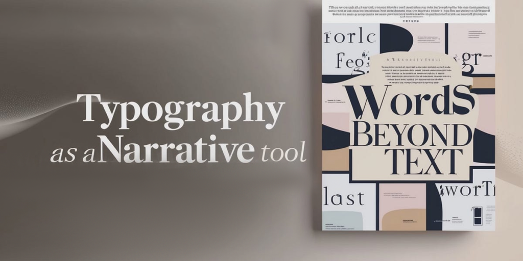
Typography is not just about readability; it is about personality. The weight, slant, and style of your font tell a story before the reader begins chapter one. Fonts carry their own psychological baggage, and choosing the wrong one can create a “cognitive dissonance” that confuses the reader.
Serif vs. Sans Serif
Serif fonts, which feature small decorative lines at the ends of characters, are often associated with tradition, authority, and timelessness. These are the standard choices for historical fiction, literary fiction, and academic non-fiction. They suggest a level of seriousness and established credibility.
Sans serif fonts, which are cleaner and more modern, suggest simplicity, technology, and progress. These are widely used in contemporary thrillers and young adult novels. For a deeper look at how typography impacts design, you can explore the resources provided by the AIGA (The Professional Association for Design).
The “Feel” of the Font
In the thriller genre, fonts are often bold, capitalized, and “heavy,” suggesting a high-stakes plot. In historical romance, you will find elegant, flowing scripts that mimic handwriting from a bygone era. At Bright Book Publishing, our designers pay meticulous attention to book cover typography to ensure the font choice resonates with the emotional core of the manuscript.
3. Composition and Imagery: Setting the Scene
How the elements are arranged on the cover also plays a role in the reader’s decision-making process. The composition of a cover helps establish the “scale” of the story.
The Lone Figure
A common trope in both thrillers and certain types of literary fiction is the lone figure, often with their back to the viewer or shown in silhouette. This composition creates a sense of isolation and mystery. It invites the reader to step into the character’s shoes and experience the journey alongside them.
The “Big Room” or Landscape
In epic fantasy or sweeping historical dramas, the landscape is often the star of the cover. Showing a small figure against a massive, detailed background signals that the story has a grand scope and high stakes. It tells the reader that world-building is a significant part of the experience.
Abstract and Minimalist Design
Contemporary literary fiction often leans toward abstract or minimalist designs. These covers do not show a specific scene but rather a mood or a symbol. This suggests a more “intellectual” or “artistic” reading experience. This trend has become increasingly popular on platforms like Pinterest, where visual trends for books are often born and cultivated.
4. The Power of Genre Tropes and Symbols
Readers are conditioned to look for specific “symbols” that act as shorthand for their favorite genres. These tropes are not cliches; they are essential navigational tools.
- A Dagger or a Smoking Gun: Instantly signals a murder mystery or crime thriller.
- A Sprawling Mansion or a Lonely House: Suggests a gothic romance or a haunted house story.
- Spaceships or Planets: Clearly defines the book as science fiction.
- Floral Patterns: Often indicates a lighthearted contemporary romance or a gardening non-fiction book.
If you deviate too far from these symbols in an attempt to be “original,” you may lose the very readers who are actively looking for your type of story. The goal is to be “fresh yet familiar.” You want to provide enough of a genre signal to be recognized while adding enough unique flair to stand out.
5. Designing for the “Thumbnail” Era
Most readers today discover books on digital storefronts like Amazon KDP or BookBub. On these platforms, your cover is often viewed as a tiny thumbnail on a smartphone screen. The psychology of design changes when you are working with limited real estate.
A cover that is too cluttered or has tiny, intricate details will fail in a digital environment. High contrast and bold typography become even more important here. The “hero” of the cover, whether it is the title or a central image, must be clear even at one inch in size. If a reader cannot understand what the book is about in a half-second glance, they will keep scrolling.
6. Why Professional Design Outperforms DIY
Many indie authors attempt to design their own covers using free tools. While these tools are becoming more advanced, they lack the deep understanding of “visual marketing psychology” that a professional designer brings to the table. A professional designer understands how to balance “negative space,” how to lead the eye toward the most important information, and how to technically prepare files for printing.
According to data from The Authors Guild, books with professional covers consistently see higher click-through rates and better long-term sales. This is because a professional cover removes the “amateur” barrier. It tells the reader that the author has invested in their work, which increases the perceived value of the story.
At Bright Book Publishing, we combine artistic creativity with market research to provide bespoke book cover designs that don’t just look pretty; they sell. We look at current trends in your specific niche to ensure your book looks like it belongs on the “Bestseller” list.
7. The Role of Branding in Series Design
If you are writing a series, the psychology of your covers becomes even more complex. You are no longer just selling one book; you are selling a “brand.” A series must have a consistent visual language. This might mean using the same font for the title on every book or a consistent color treatment for the imagery.
Consistency builds trust. When a reader finishes Book One and goes looking for Book Two, they should be able to recognize it instantly based on the cover’s “vibe.” This creates a sense of familiarity and comfort, encouraging the reader to continue the journey. You can see examples of successful series branding in our portfolio of published works.
Conclusion: Signaling Success
Your book cover is the silent spokesperson for your manuscript. It is working 24 hours a day to find your readers, whisper to their subconscious, and convince them to click “buy now.” By understanding the psychological expectations of your genre, you can create a cover that acts as a beacon for your ideal audience.
Do not let a weak cover hold back a strong story. Investing in professional design is one of the most effective ways to ensure your book reaches its full potential. When your cover signals the right message to the right readers, the rest of the publishing journey becomes much smoother.
Is your book cover sending the right message?
If you want a cover that captures the heart of your story and the attention of your readers, the team at Bright Book Publishing is here to help. From manuscript editing to final book editing, we provide everything you need to become a successful author.
Visit our Book Cover Design page today to start a conversation about your project. Let us help you create a first impression that lasts a lifetime.